ORDERUP PICKUP Takeout App
Talent Showcased: Design, Client-side Development, Markup
Objective: Promote and sell food.
Target Audience: Teenagers, young adults, adults, and parents.
Highlights:
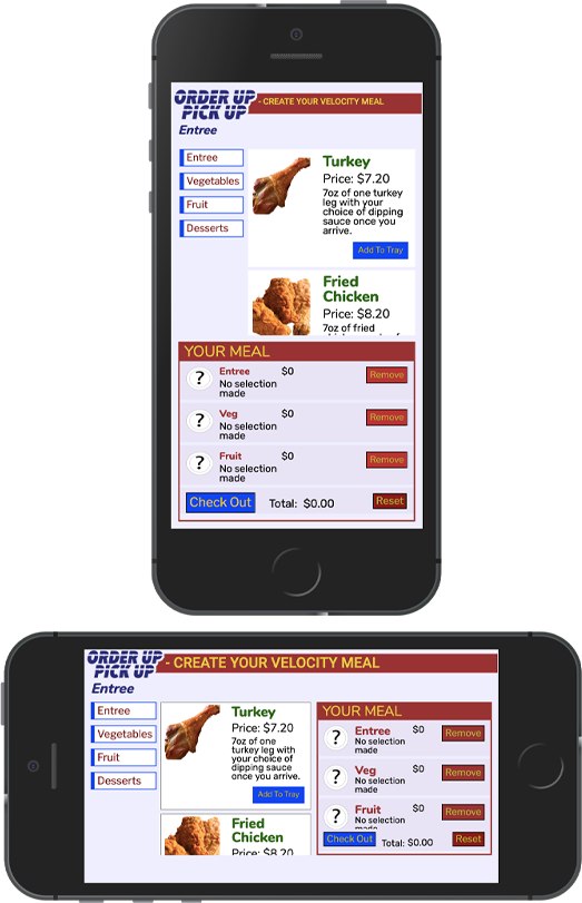
- ‣ This browser-delivered mobile app was carefully designed for both landscape and portrait orientations. Make sure that you experience both orientations to see the differences in layout.
- ‣ The sequence of screens was carefully designed to help users smoothly and painlessly order their food, from the unmistakable start button on the home screen to the clickable food options that all have visuals as well as text.
- ‣ Red and blue were chosen as the two main hues because they both give off a sense of fun and cheer.
- ‣ The striped gaps in the ORDER UP PICK UP logo resemble tire marks, fitting with the concept of customers driving to pick up their meals.
- ‣ When the user clicks the Add To Tray button on one of the food choices, JavaScript stores the choice in localStorage, and updates the Your Meal area to show the appropriate graphic, text, price, and the total amount owed. The user is also given controls to remove items from their tray whenever they want.


